Beta Build Journal
For Sugar Craze's beta build, I focused a lot on the game's interface and menus and getting the Hide, Run, and Fight mechanic working. It took some time since I realized that Harlowe, unlike Sugarcube, another Twine story format, did not have a built-in menu/sidebar menu. I had to make what I wanted from scratch. After looking around on the internet and watching multiple tutorials, I made a menu I am okay with and a functioning sidebar where players can check their status, save, load, and restart their game. I also tweaked the game's visuals by changing the colors for links to match the dark pink instead of using Twine's default settings. All the menus/sidebar elements I implemented made it easier to navigate to important information and keep track of things like health and noise. It also kept everything organized/took off so much work since I did not need to constantly add links to stats and the save/load menu. Having that information readily available made it so players could always keep track of how much noise they're making and factor that into their decisions.
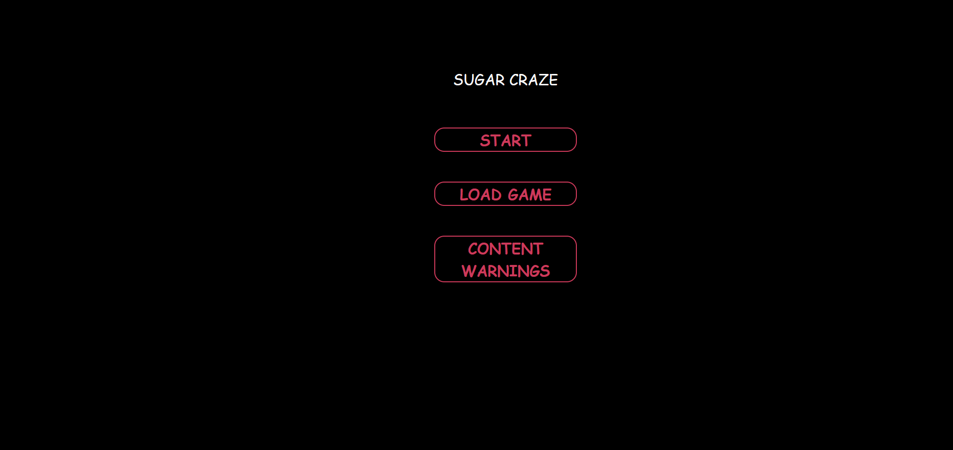
The Menu Screen
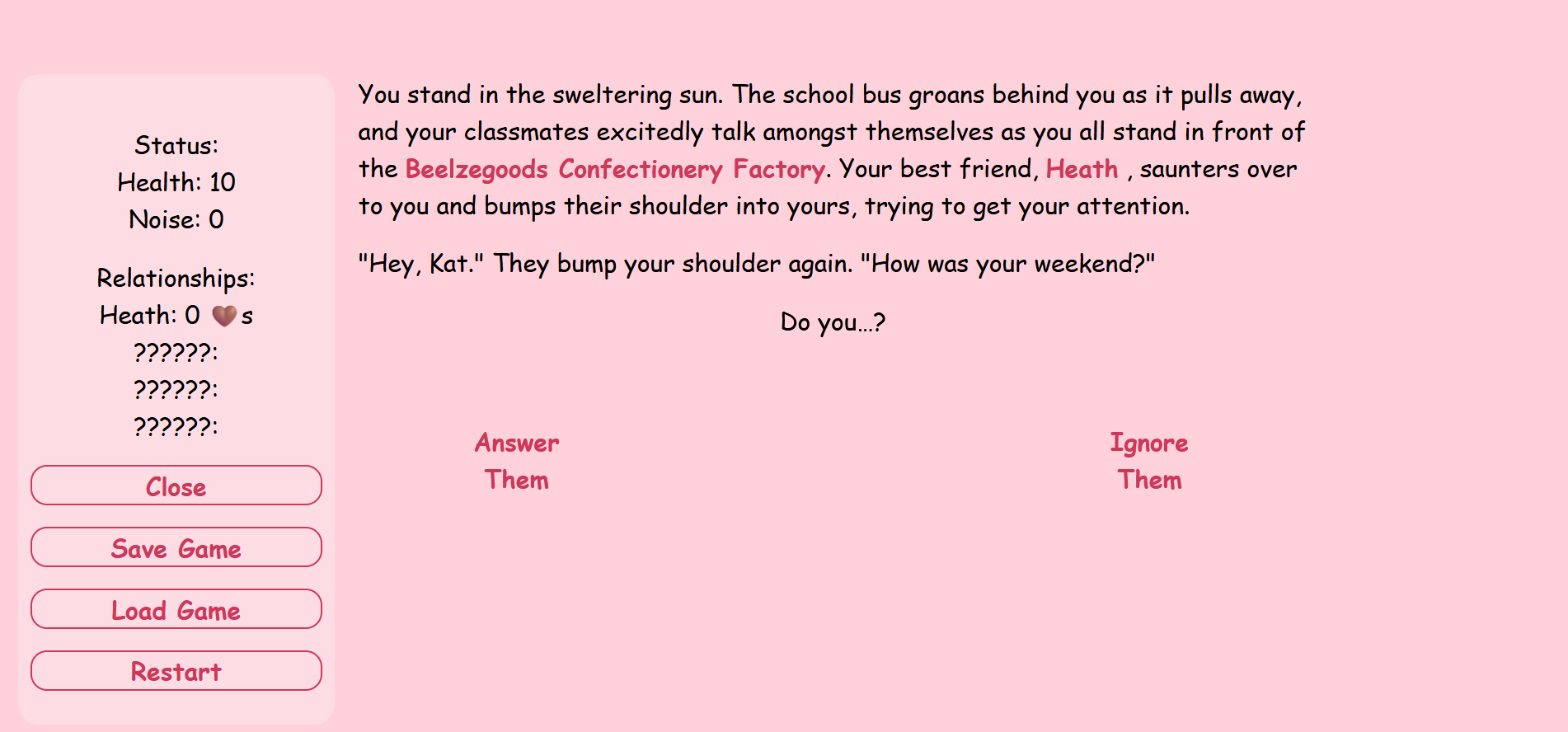
One feedback I received for my Art Build was to keep colors in mind, especially with how players perceive my game. I want to play around more with colors in the future. In this build, I've highlighted important information (by linking them to something), making them stand out from the regular text. In the future, I want to do more with links and experiment with simulating different effects without relying on drawing. Besides that, some people mentioned that I should start adding some pictures. In this version, I added one to see how it would look and to test out styling it in passages.
The sidebar, current game status, and text highlights.
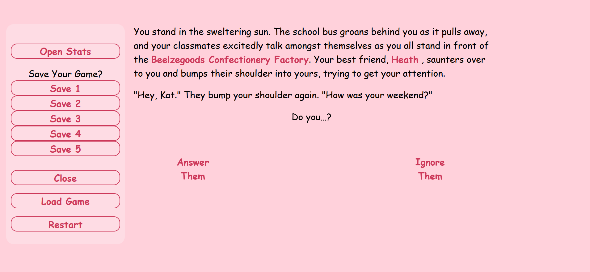
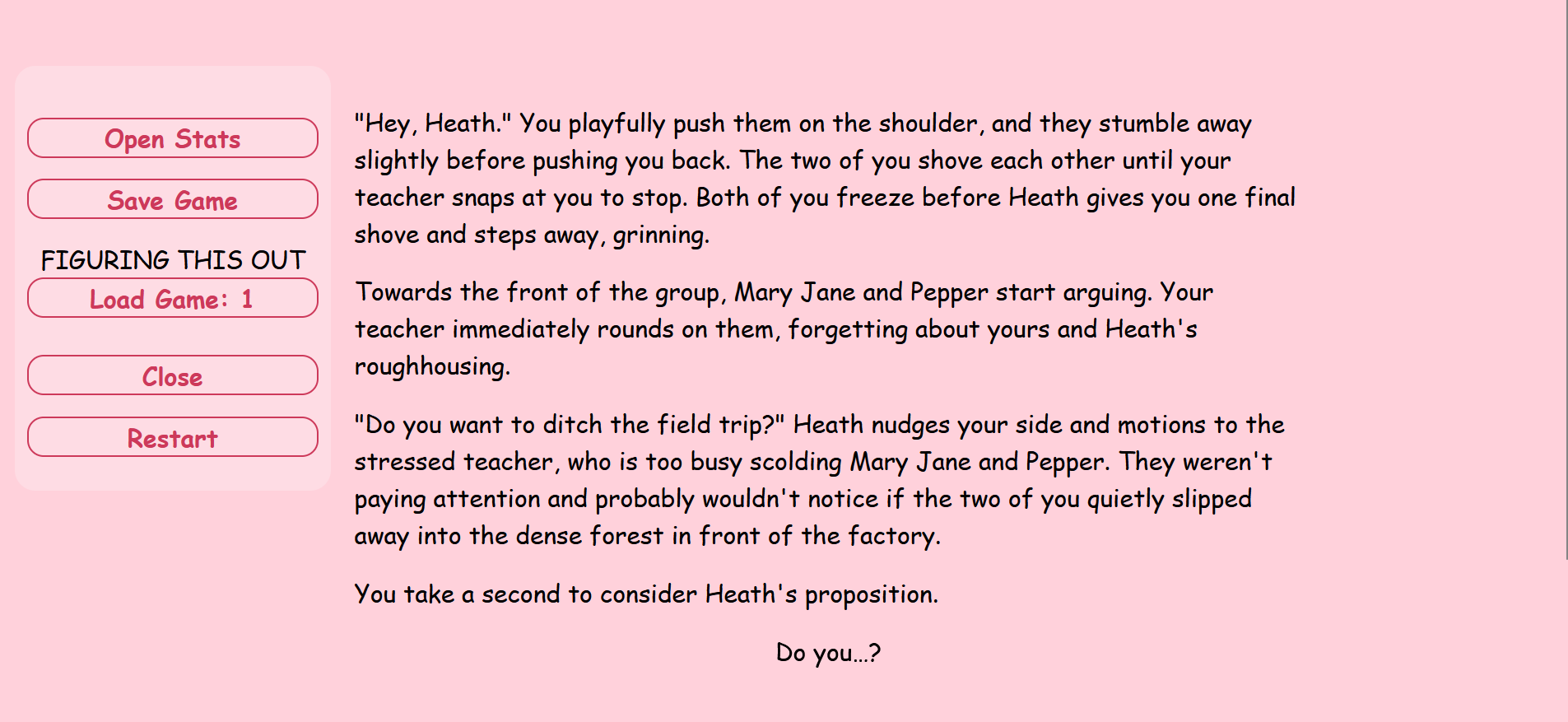
While working on my beta, I ran into an issue with pop-up windows and how they interacted with the passage behind them. They looked too awkward, and they had a scroll bar that I didn't want to be there. I tried adjusting the size of the window, but I didn't like how it looked. Eventually, I decided to scrap the idea of a pop-up window and had the information show up in the sidebar instead. I also had issues with setting up a multiple saves function. My current solution is creating a separate button for each save/loaded game, but that heavily relies on players remembering what each save was. This was another feature in which Harlowe doesn't have built-in, but Sugarcube does. When I found this out, I considered switching over but decided against it. Although my current solution isn't the cleanest, I'll see if there's another way to make what's in the save clearer.
How the save option looks in the game.
How the load option shows up in game
Files
Sugar Craze: Demo
A final girl choose-your-own adventure game
| Status | Prototype |
| Author | cosmictacos |
| Genre | Visual Novel, Survival |
| Tags | Comedy, Creepy, Horror, Mystery, Singleplayer, Twine |
More posts
- PostmortemNov 11, 2024
- Art Build JournalOct 09, 2024
- Prototype JournalSep 25, 2024


